Photography
How to desaturate shadows for 3D contrast.
Digital capture technology is really awesome and has truly changed photography, improving it in a multitude of ways. But sometimes, digitally captured images have a certain exaggerated colorfulness, that just looks a little off, for those of us raised on the old fashioned film days! I have found that this has to do with the way color gets saturated as contrast increases. Even standard rendering presets increase contrast a bit through a global RGB composite curve, often indirectly. It seems that when contrast increases this way a global increase in saturation results that increases the chroma, or colorfulness, evenly throughout the image. This makes shadow values unrealistically colorful. Our natural perception of color decreases with reduced light, such that, as a shadow approaches black, color saturation is gradually reduced to zero. If you can correct for the tendency to increase color in the shadows as contrast is increased, you can achieve a more natural sense of contest and 3D shape in the image.
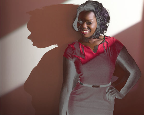
Lets take a look using the following example:
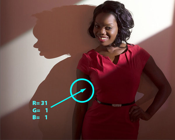
The RGB values in the arm, right before it goes to zero black is 31, 1, 1 – way too colorful for a shadow this dark!
Looking at the deep shadow at her right arm, we can see a subtle region of exaggerated color in the deep shadow. Reading the RGB values confirms this—the reading of 31,1,1 is unrealistically colorful—we can see a sort of band of extra deep color right next to the black shadow. This is the bane of digital capture, in my humble opinion! Lets see what happens when we fix this.
Start by selecting Solid Color from the adjustment layer icon at the bottom of the Layers panel – this type of layer is not available from the Adjustments panel, so you have to get it there! The idea is to use this gray color to desaturate the underlying layers selectively – right now the solid gray covers up the whole image! Now we will use Blending Options to change how this gray interacts with the image – select Blending Options from the layer options flyaway menu at the upper right corner of the Layers panel.
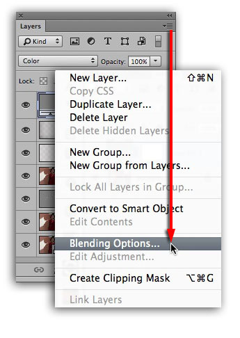
Select “Blending Options…” from the flyaway menu in the Layers panel
The Blending Options dialog is where we can adjust the layer blending so that the gray is only covering the shadow parts of the image. To do this move the white slider to the left until most of the image is revealed with only the darkest parts covered by gray!
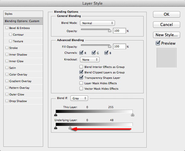
Move the white slider to the left to reveal the brighter parts of the image.
Now we have to soften the transition of the gray color so it blends smoothly. To do this, break apart the white slider into two haves by option/alt – dragging it apart and to the left! Don’t hit “OK” yet – there’s one more thing to do…
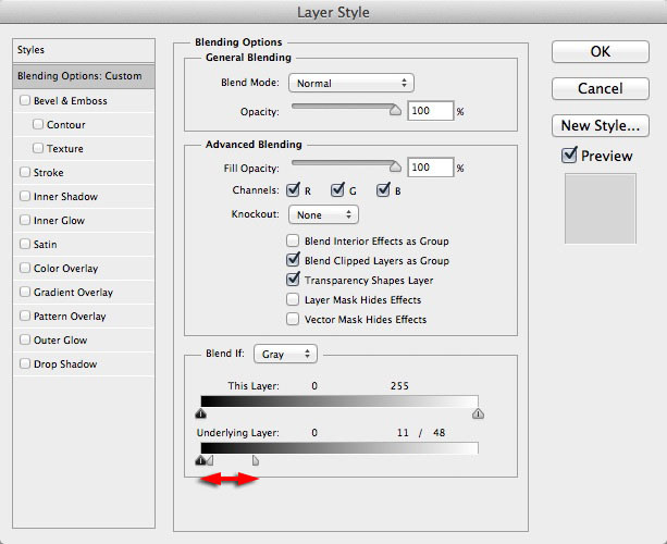
Option/alt drag apart the white slider into two halves to soften the transition of gray into the shadow parts of the image.
The gray color now blends smoothly into the shadows…
The gray color blends smoothly based on how wide the slider is split.
Of course, we aren’t going to use the image like this—we can change the layer blend mode from normal to color, right in the Blending Options dialog or in the Layers panel!
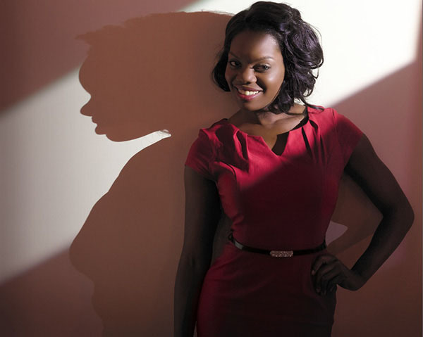
The de-saturated shadows actually look darker, even though they are the same luminosity as before – the eye sees less saturated color as darker!
Compare this image with the first in the series. The de-saturated shadows look darker, giving the image better contrast in the shadows, eliminating the band of rich color next to the darkest shadow. I often reduce the opacity of the de-sat layer just a bit and sometimes work the layer mask selectively to bring back a little color where I might like it—I did that here, masking it off her right side to “highlight” the shapely curves of her torso.
It is surprising how powerful this simple technique is! The subtle de-saturating of shadows most often results in more dimension of shape in the shadows and makes the image look more natural and less “digital”
——
To see a more detailed version of this post go to Lee’s website.
Lee teaches techniques like this in his PPSOP class: Portrait Retouching Fundamentals:
And he also teaches a Photoshop Layers class.
For even more advanced techniques, check out Lee’s Photo-Illustration course.
Video
Adobe Creative Cloud for Photographers.
We recently shared a very good deal on Adobe’s Creative Cloud for Students and Teachers ($16.58 per month for ALL the Adobe applications). Since we use Premiere Pro, SpeedGrade, In Design and other apps this solution makes complete financial sense for us. But, what if you are a photographer using only Lightroom and Photoshop?