Video
Wall Street’s Inside Job – good and bad examples.
I recently watched “Inside Job” a fascinatingly disturbing documentary about the reasons that caused Wall Street’s last financial meltdown. Rotten Tomatoes said it best:
“a disheartening but essential viewing, Ferguson’s documentary explores the Global Financial Crisis with exemplary rigor.”
Besides the story, and the shocking realization that most of the culprits are still in positions of power, I was very intrigued by the lighting, framing and camera placement. My guess is that the documentary was shot by different crews, one skilled and one not so much.
Let’s take a look at the following good examples:
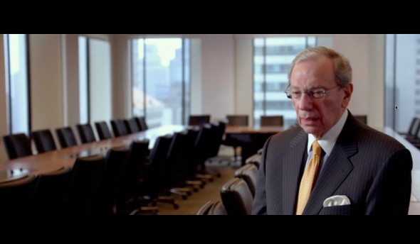
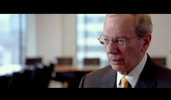
Nice establishing shot, very nice lighting, a well-framed extreme close up that makes sense, and even a well organized room. This is good.
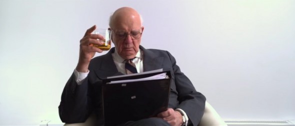
Now, let’s take a look at a couple of not so great examples:
Click to keep reading
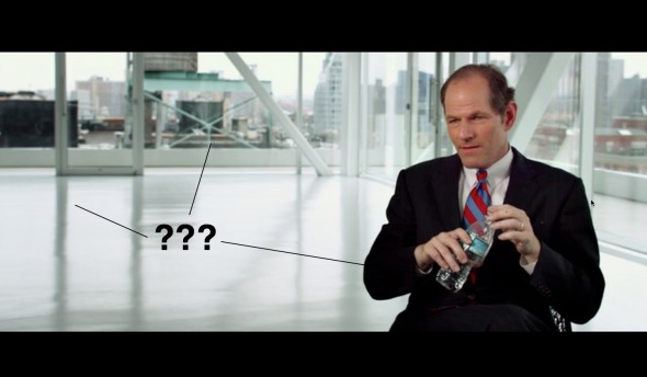
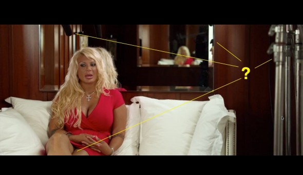
Wow…A C-stand and a mic on the shot, bizarre framing, the mirror’s reflections, the water bottle…who was the producer in charge?
Unfortunately the second “style” prevails over the documentary, greatly diminishing the impact this very serious topic should have. Most of the interviews with journalists, politicians, and financial insiders are very well done, but my favorite was Frederic Mishking’s.
You can read Mishking’s “explanation” on the Financial Times, as well as Charles Ferguson’s (the documentary’s director) reply. Here’s also an interesting New York Times review. And here’s the trailer.
On being interviewed about this film, Henry Rollins likened Ferguson’s interviewing techniques to “tightening the screws little by little until the interviewee starts to say “Ow…..ow…..ow and then, Stop the camera!”
Do you have any additional information on how the documentary was shot, or why such simple mistakes made it into the final cut?