News
Putting us on the map.
We are proud to announce that Eduardo Angel LLC is now on a digital map called, Made in New York, a great resource developed by Mayor Michael Bloomberg for tech companies, investors, developers and designers. Featuring more than 500 local companies across the city’s five boroughs, including 325 that are presently hiring, the projects’s goal is to interactively show what is happening in the technology industry throughout the five boroughs.
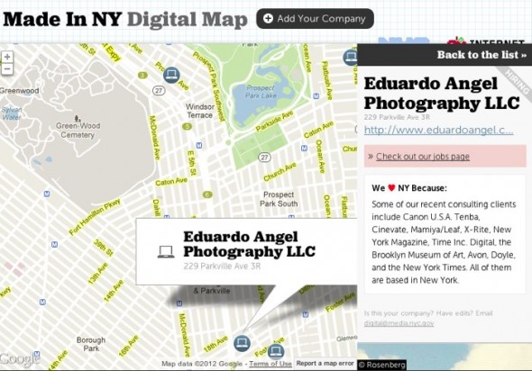
“We expect this map to be another tool that helps propel our tech industry forward,” Bloomberg said . “The growth of the tech industry in New York City has been a critical part of weathering the nation’s economic downturn, far better than the rest of the country.” Since the map plots companies by location, job seekers can explore their desired neighborhoods, making this a fantastic resource for anyone who lives or is moving to New York City to find jobs in the technology sector. The map can be also be sorted by digital companies, investors, and co-working and incubator spaces.
Video
Seeing Information.
We have been trying innovative ways to make our content more visually appealing. Here are some of the most recent features that you might not know.
• The Tag Cloud is great. The more we write about a topic the bigger it gets in the “cloud.” Simply click on one word to access the most relevant articles. 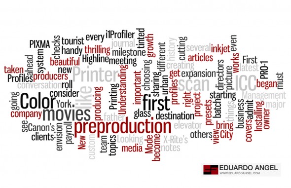
• The Event Calendar (on your right) is very easy to share, subscribe to, and download (Google Calendar, iCal, etc). The Colored Categories are now much easier to read. This is a brand new edition. 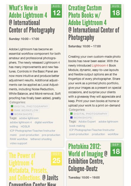
• Visual Serendipity is our ongoing weekly series of images taken with a cellphone. You can access all the images by simply searching for “Visual Serendipity”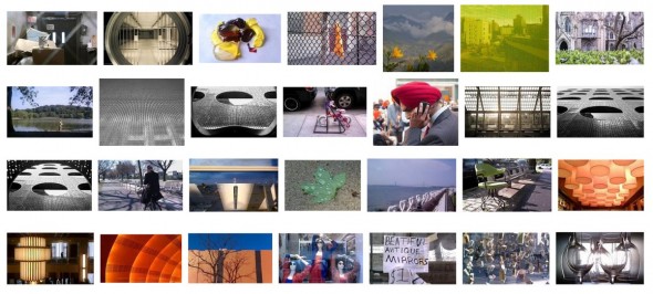
• We have been on Tumblr for a long time. We love the site’s interaction with other photographers and bloggers, as well as the beautiful looking menu of “recent posts.”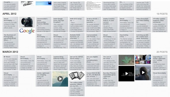
• We are part of Bloomberg’s Digital Map for Tech Companies in New York. Come back tomorrow to learn more about this great project.
• And our Visuals page keeps growing and changing. We are hosting our images on PhotoShelter and have been very happy with the results.
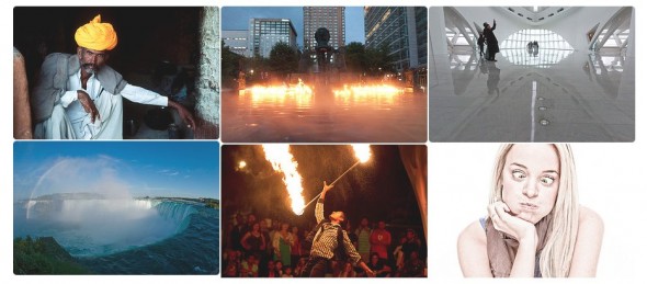
So, how are we doing? Do you like the graphics as much as we do? What can we do better to improve the site? Talk to us.
Video
Anatomy of a Title Sequence. Interview.
Peter Crandall, a great friend and fantastic artist, designed the new opening title sequences (see below) for all of our videos. After proudly sharing them with other people, we realized that we wanted to know more about the whole process, so here is a recent conversation.
Tell us a little bit about where you are with your career.
I’ve been freelancing as a motion designer in Los Angeles for the past eight years. The majority of my experience and projects in motion design have been in the entertainment industry, which has entailed designing motion graphics for television shows/networks, opening title sequences to film, TV promos, commercials, and web videos.
Apple Inc. contacted me last fall (2011) to work at their Cupertino office to help out with some projects in their marketing department. In short, I’ve recently relocated to Silicon Valley and I’m now working more regularly with Apple. The relationships I have with the LA studios are still very important to me so I do my best to continue working with those studios when they contact me.
I understand you worked on Apple’s new iPhone campaign, can you tell us a bit more about that experience?
Working at Apple for a few months in preparation for the iPhone 4S launch was exciting and unique in a few ways for me. First, the focus is not on any celebrity, television show or other consumer media, but on a product; in this case the iPhone 4S. Second, Apple has a very established and successful marketing brand. Since the overall visual language of Apple is very simple and clean, the designing doesn’t lend itself exploring a wide spectrum of creativity like other brands in the entertainment industry I’ve worked with. Overall, the experience of working with the very talented team during the launch of the iPhone 4S was simply amazing.
Could you take us through the design process of “eduardoangel.com” from the early concepts, to the development stage and final execution? We are especially curious about how you decide on specific design elements like color scheme, typography, audio, and even the length.
Just like any project I start, the first thing I did in the design process for creating the intro animations of “eduardoangel.com” was to talk with Mr. Angel about his company and the context in which the intro sequence would exist.
The key concept I came away with from talking with Mr. Angel in developing the intro animation was the importance of the content itself. The web site covers many topics, so I thought about how they could be conveyed and ultimately turned keywords from the “tag cloud” on the site into a slot-machine style animation based on the keywords.
Having many different words whiz by helps give a sense of volume to the content, but at the same time help it remain playful. Since the function of the animation is an opening sequence to video content, I wanted the length of the animation to be informative and concise. After doing some tests and getting a good “feel” for the animation I started to explore some sound effects that would compliment the motion and reinforce the professional and friendly qualities of the web site as a whole.